
요즘 키보드만으로 브라우저를 조작할 수 있도록 공부를 해보고 있다.
이 글은 키보드 유저를 위한 tabtrap이라는 기술에 대해 다룬다.
Tab Trap
모달은 사라질 때까지 사용자는 그 영역에서만 집중할 수 있어야하고, 모달을 닫기 전까지는 벗어나서는 안된다.
해당 기법을 위한 tab trap을 구현하는 방식은 간단한데
모달의 첫 엘레먼트와 마지막 엘레먼트를 체크한 이후,
마지막 엘레멘트에서 tab keyboard 이벤트가 들어올 경우 처음 엘레먼트로 이동시키고
반대로 첫번째 엘레먼트에서 shift + tab keyboard 이벤트가 들어올 경우 마지막 엘레멘트로 이동시킨다.
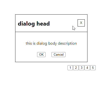
dialog 코드 예시로 보자.
// getPortal 함수, Portal 컴포넌트 등은 react의 createPortal를 사용하기 위한 추가적인 함수
function getPortal() {
  if(typeof window !== 'object') return null;
  let portalRoot = document.getElementById("portal");

  if (!portalRoot) {
    portalRoot = document.createElement("div");
    portalRoot.setAttribute("id", "portal");
    document.body.appendChild(portalRoot);
  }

  return portalRoot;
}

const Portal = ({ children }) => {
  const element =
    typeof window !== "undefined" && getPortal();
  return element && children ? createPortal(children, element) : null;
};


const DIALOG_HEAD = ':dialog-head:'
const DIALOG_PARAGRAPH = ':dialog_paragraph:'

const Dialog = ({
}) => {
  return <Portal>
      <DialogWrapper ref={ref} tabIndex={-1} role="dialog" aria-modal="true" aria-labelledby={DIALOG_HEAD} aria-describedby={DIALOG_PARAGRAPH}>
        <DialogHead>
          <h2 id={DIALOG_HEAD}>dialog head</h2>
          <IconButton aria-label="close button">X</IconButton> {/* tag를 icon or svg로 해야하는데 귀차니즘으로 생략 */}
        </DialogHead>

        <DialogBody>
        <p id={DIALOG_PARAGRAPH}>this is dialog body description
        </p>

        </DialogBody>

        <ButtonWrapper>
        <button type="button">OK</button>
        <button type="button">Cancel</button>
        </ButtonWrapper>
      </DialogWrapper>
  </Portal>
};

copound pattern까지 넣어서 설명할까 하다가 배보다 배꼽이 커지는거 같아서
직관적인 마크업으로 작성했다.
위 구현 예시는 아직 tab Trap이 구현되지 않은 예시이다.
여기서 tab으로 화면을 순회한다면?
마지막 엘레먼트(Cancel)에서 tab을 누르는 순간 포커스가 화면 밖으로 나가게된다.
만약 dialog가 열린 경우 다른 엘레먼트의 작동을 비활성화 해놓았다면
tab을 사용하는 저시력 사용자의 경우 브라우저를 이용하는데 애로사항이 생길 수 있다.
그래서 tab trap을 적용하여 dialog를 다시 만들어보자.
const DIALOG_HEAD = ':dialog-head:'
const DIALOG_PARAGRAPH = ':dialog_paragraph:'

const Dialog = ({
}) => {

  const ref = useRef(null);

  useEffect(() => {
    let focusableElements = ref.current.querySelectorAll(
      'a[href], button, textarea, input[type="text"], input[type="radio"], input[type="checkbox"], select, [tabindex="0"]'
    );

    let firstFocusableElement = focusableElements[0];
    let lastFocusableElement = focusableElements[focusableElements.length - 1];

    const handleKeyDown = (event) => {
      if (event.key === 'Tab') {
        focusableElements = ref.current.querySelectorAll(
          'a[href], button, textarea, input[type="text"], input[type="radio"],
          input[type="checkbox"], select, [tabindex="0"]'
        );

        firstFocusableElement = focusableElements[0];
        lastFocusableElement = focusableElements[focusableElements.length - 1];

        if (event.shiftKey && document.activeElement === firstFocusableElement) {
          lastFocusableElement.focus();
          event.preventDefault();
        } else if (!event.shiftKey && document.activeElement === lastFocusableElement) {
          firstFocusableElement.focus();
          event.preventDefault();
        }
      }
    };

    firstFocusableElement.focus();
    ref.current.addEventListener('keydown', handleKeyDown);
    return () => {
      ref.current.removeEventListener('keydown', handleKeyDown);
    };
  }, []);


  return <Portal>
      <DialogWrapper ref={ref} tabIndex={-1} role="dialog" aria-modal="true" aria-labelledby={DIALOG_HEAD} aria-describedby={DIALOG_PARAGRAPH}>
        <DialogHead>
          <h2 id={DIALOG_HEAD}>dialog head</h2>
          <IconButton aria-label="close button">X</IconButton> {/* tag를 icon or svg로 해야하는데 귀차니즘으로 생략 */}
        </DialogHead>

        <DialogBody>
        <p id={DIALOG_PARAGRAPH}>this is dialog body description
        </p>

        </DialogBody>

        <ButtonWrapper>
        <button type="button">OK</button>
        <button type="button">Cancel</button>
        </ButtonWrapper>
      </DialogWrapper>
  </Portal>
};
해당 코드의 경우 dialog이 열릴 경우 맨 처음 focus 가능한 element에 focus가 잡히고, 그 후 tab을 이용해 이동시
밖으로 못 빠져나가게 자바스크립트로 구현되었다.
tab trap은 react 라이브러리인 MUI 라이브러리에도 구현되어 있다.
여담으로 찾아본 결과 웹 접근성 === 텝 접근은 아닌거 같다.
웹 접근성을 도와주는 항목중 하나가 탭 인터렉션인듯 싶은데 (교집합이 있는 집합 관계 느낌?)
이 부분은 좀 더 공부를 해봐야할듯..?
혹은 HTML tag인 inert를 외부 tag들에 넣어주면 되는데 inert는 아직 브라우징 지원이 완벽하진 않을듯하다..?
'Front-end > React' 카테고리의 다른 글
| 유연한 컴포넌트 만들기 - 모듈화와 추상화 (0) | 2023.06.10 |
|---|---|
| react HOC와 decorator (0) | 2023.05.14 |
| 프론트엔드 테스트 정리 요약 (1) | 2022.11.30 |
| react-flow에 undo, redo 구현 (2) - 함수형 패러다임 (0) | 2022.09.17 |
| react-flow에 undo, redo 구현 (0) | 2022.09.03 |